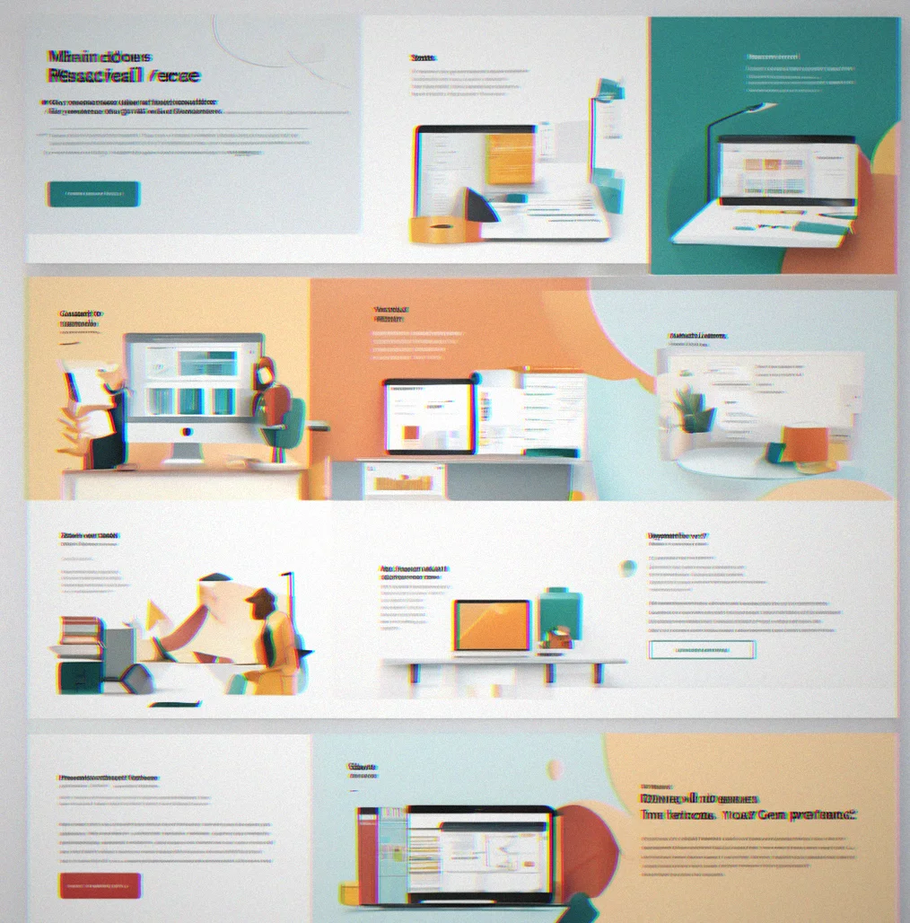
Professional services homepage with three main offerings in a grid layout, each one has an icon and a short description

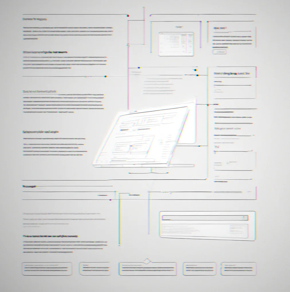
Built for mid-market B2B companies
You're dealing with something complex. Compliance tools, manufacturing, enterprise software—whatever it is, your site either blends in with everyone else or looks like a design portfolio piece. Neither one actually sells. We build sites that are straightforward and fast, built so your team can actually keep them running without needing to call someone. Skip the flashy animations pretending to explain things that shouldn't need explaining in the first place.
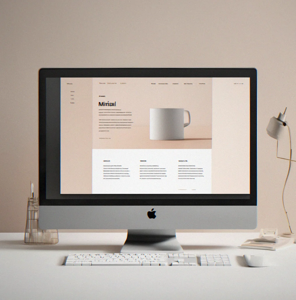

What it looks like when you cut through the clutter. These are actual sites we shipped for clients who needed to communicate something concrete. No fancy mockups, just real work.
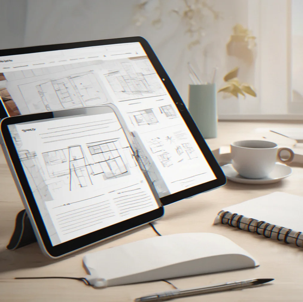
Professional services homepage with three main offerings in a grid layout, each one has an icon and a short description
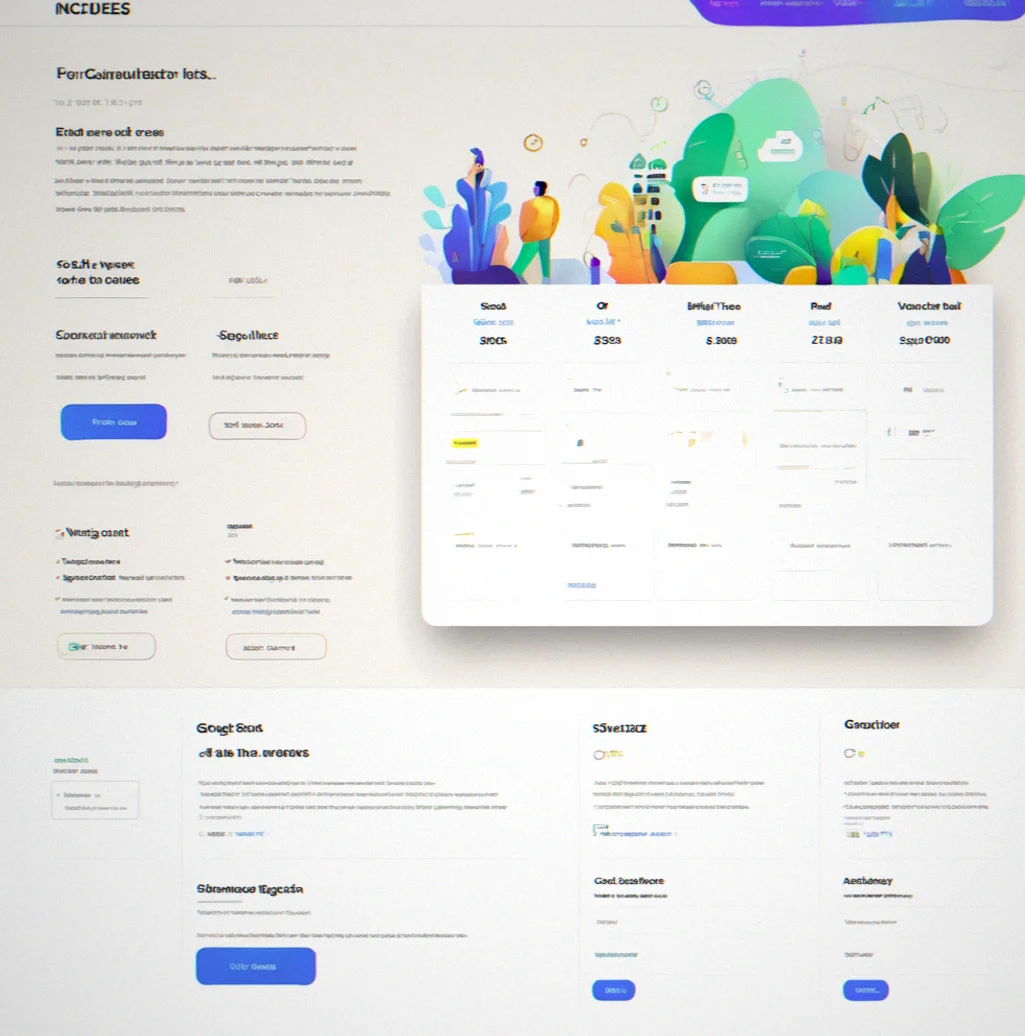
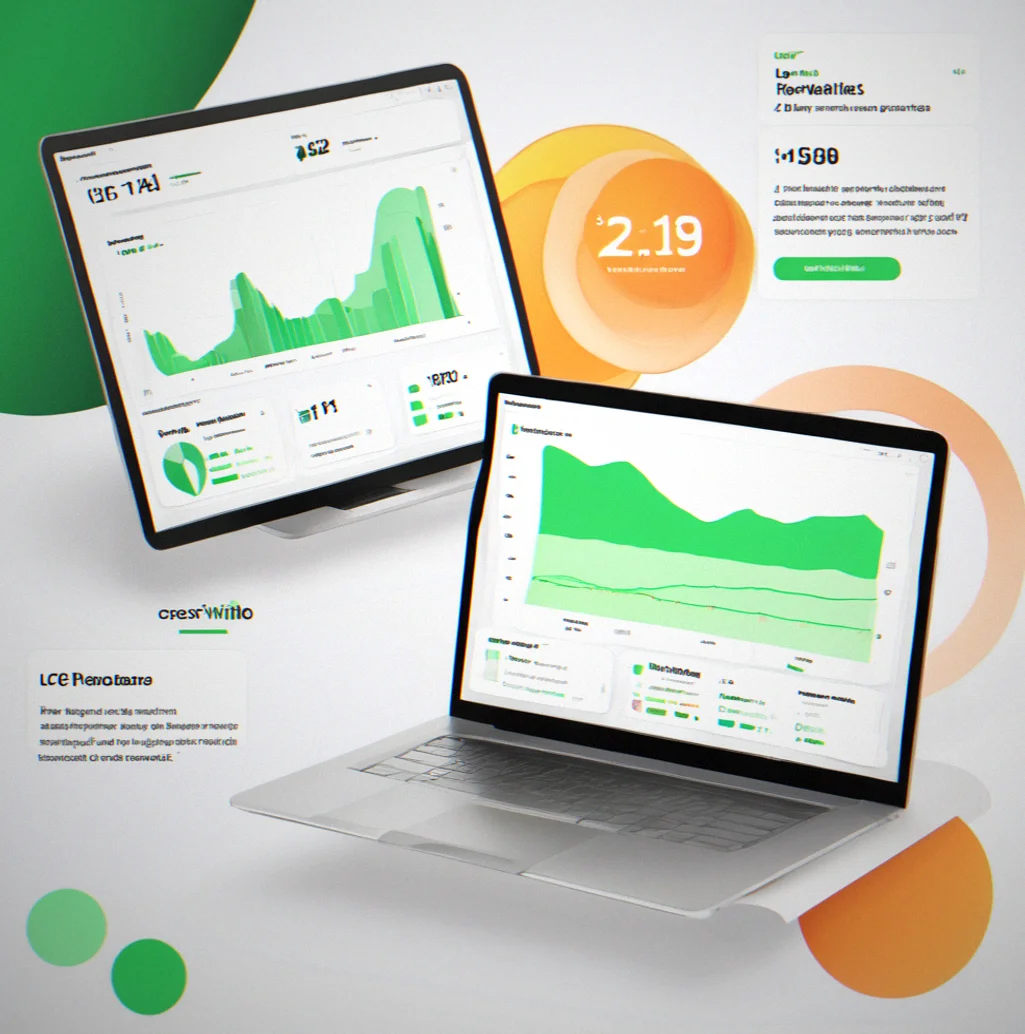
Pricing page for a SaaS product that icnludes a cost calculator. You enter your team size and usage, and it shows you the total right away without needing JavaScript

Case study for a manufacturing company showing before-and-after results in plain text, including a 34% drop in form abandonment
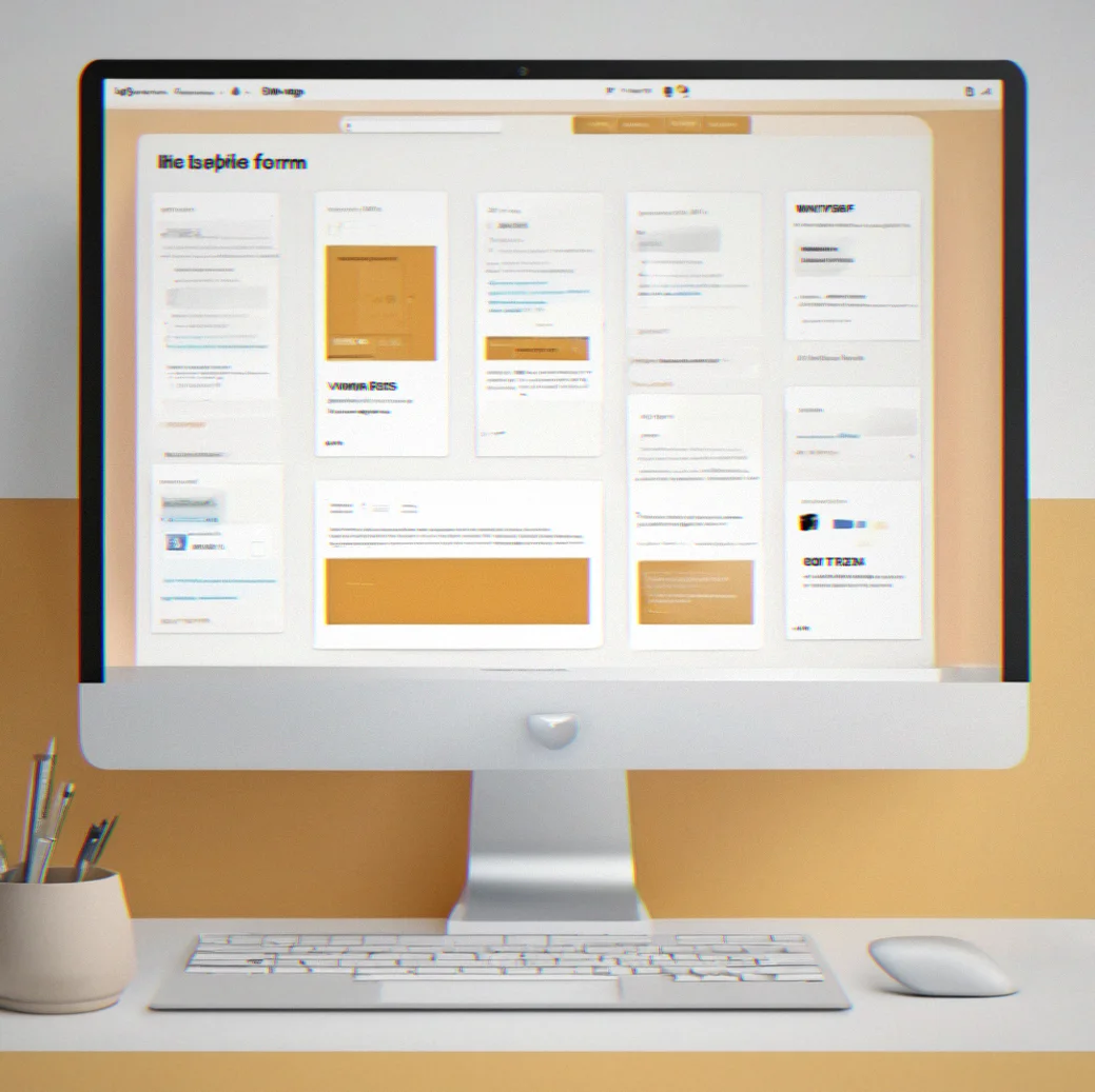
Blog CMS interface with simple form fields, a dropdown to set publish status, and a preview panel so non-technical team members can see how posts look
Most B2B buyers bail within 90 seconds if they can't find what they need. These projects show what happens when you organize things the way customers actually think instead of how your departments are set up.

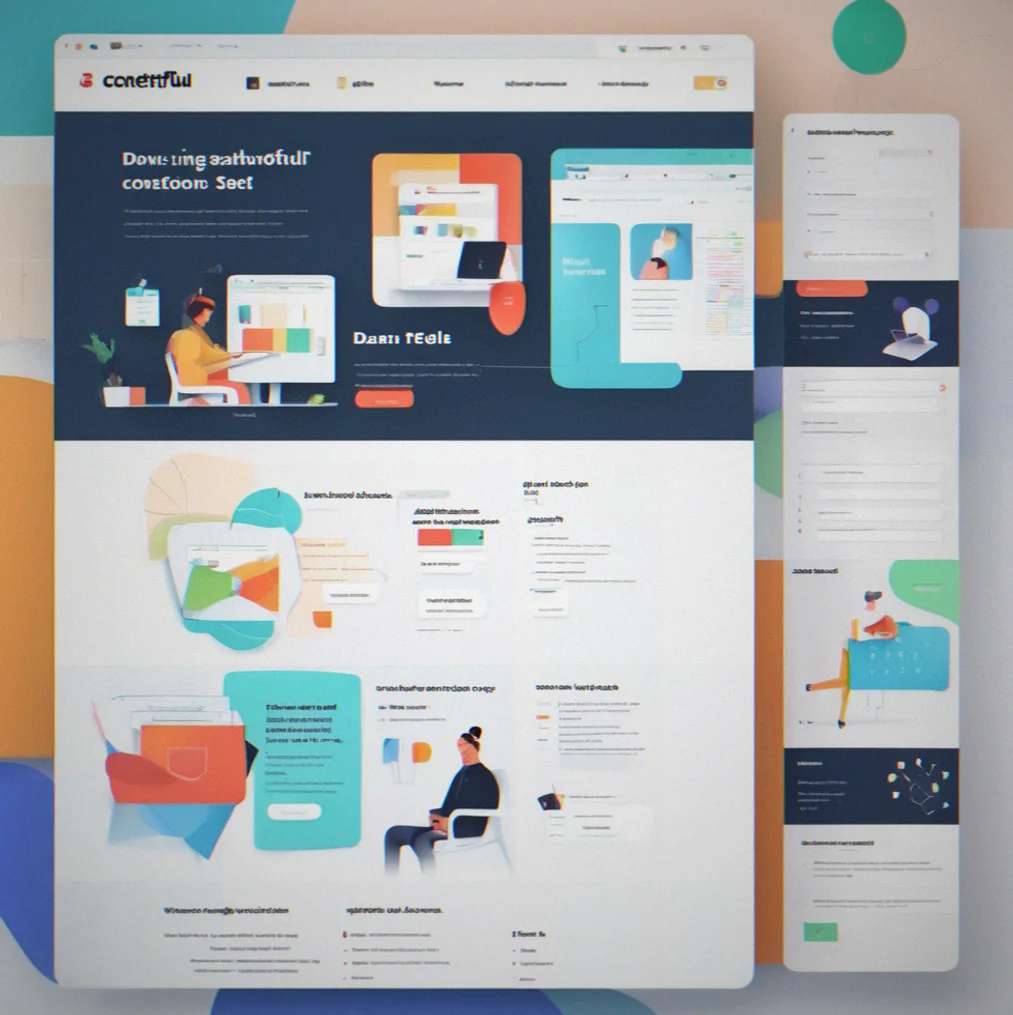
A consulting firm's service navigator on desktop with a filterable sidebar. Compliance, audit, and remediation categories are each explained in plain language, no fluff.

Manufacturing services site on mobile. The footer shhows Core Web Vitals—LCP came in at 1.6 seconds and the accessibility score hit 98 on mobile Lighthouse.

Content management dashboard with a blog post editor. Simple text fields, a publish dropdown, preview panel. Non-technical team members can actually use it.
Four things that matter when you're tired of beautiful wevsites that don't move the needle.
Your offering is complex. The site shouldn't be. We cut out everything that doesn't explain your value—no pointless animations, no buried menus, no fake stock photos. Just information laid out so people find what they need in a few minutes and actually understand it.
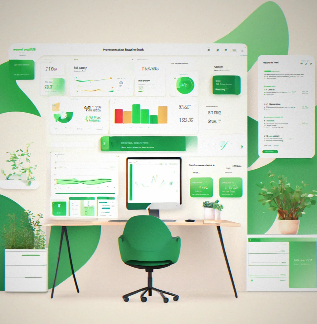
WCAG 2.1 AA compliance and Core Web Vitals under 2.5s LCP aren't optional. We build it in from day one. Fast sites rank better, load faster, and tell your customers you have your act together. We use Next.js or Astro on Vercel or Netlify. You get real numbers, not wishful thinking.
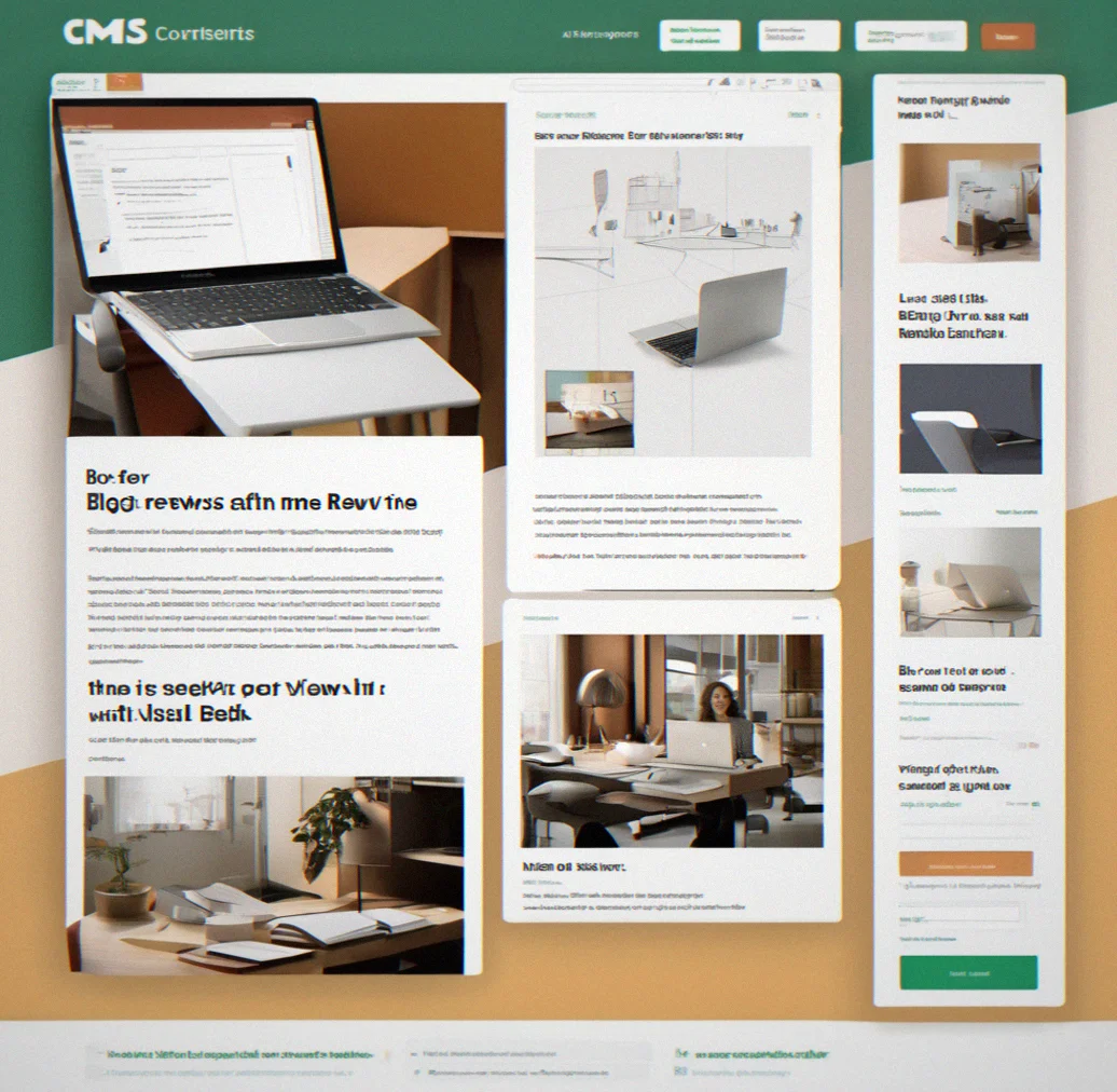
We pick a headless CMS—Contentful, Sanity or Webflow depending on what your team can handle without calling a developer. Non-technical people update content. Blog posts, case studies, pricing. They own it. That's the whole point.
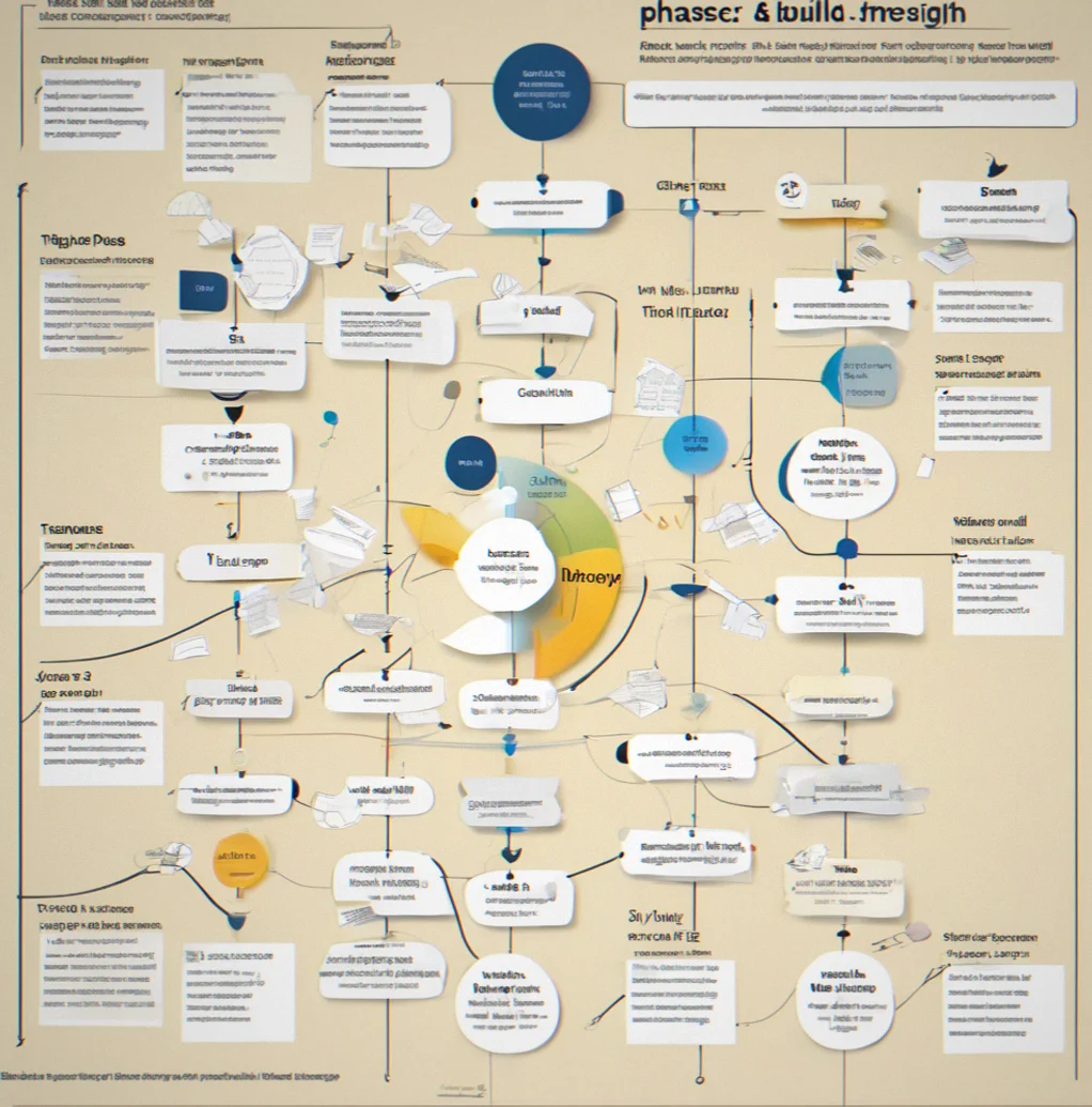
We don't hand off a design and vanish. Discovery, strategy, design, build, launch—we're in it for 10 to 16 weeks. We document the reasoning behind every call so your team knows why things are the way they are. A redesign years later shouldn't require hiring us again, though some do anyway.
Your website is probably the first real interaction a prospect has with your firm. The problem is most of them don't actually explain what you do in a way that lands. When someone lnads on your site, they've got maybe 90 seconds to figure out if you're solving their problem. They're not there for the design. They need straightforward answers delivered without friction. Everything else just gets in the way.
Most B2B decision-makers will bounce off a confusing website before they even think about calling sales. About two-thirds of them say a messy site makes them doubt whether the company knows what it's doing. These aren't just nice-looking portfolios. They're real sites built for actual companies trying to solve actual problems.
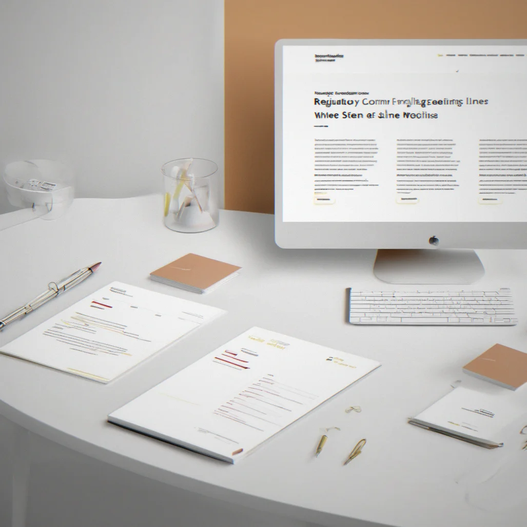
Regulatory compliance consulting firm homepage where the three service lines sit as straightforward cards with plain text explanations, nothing fancy, and loads in under two seconds
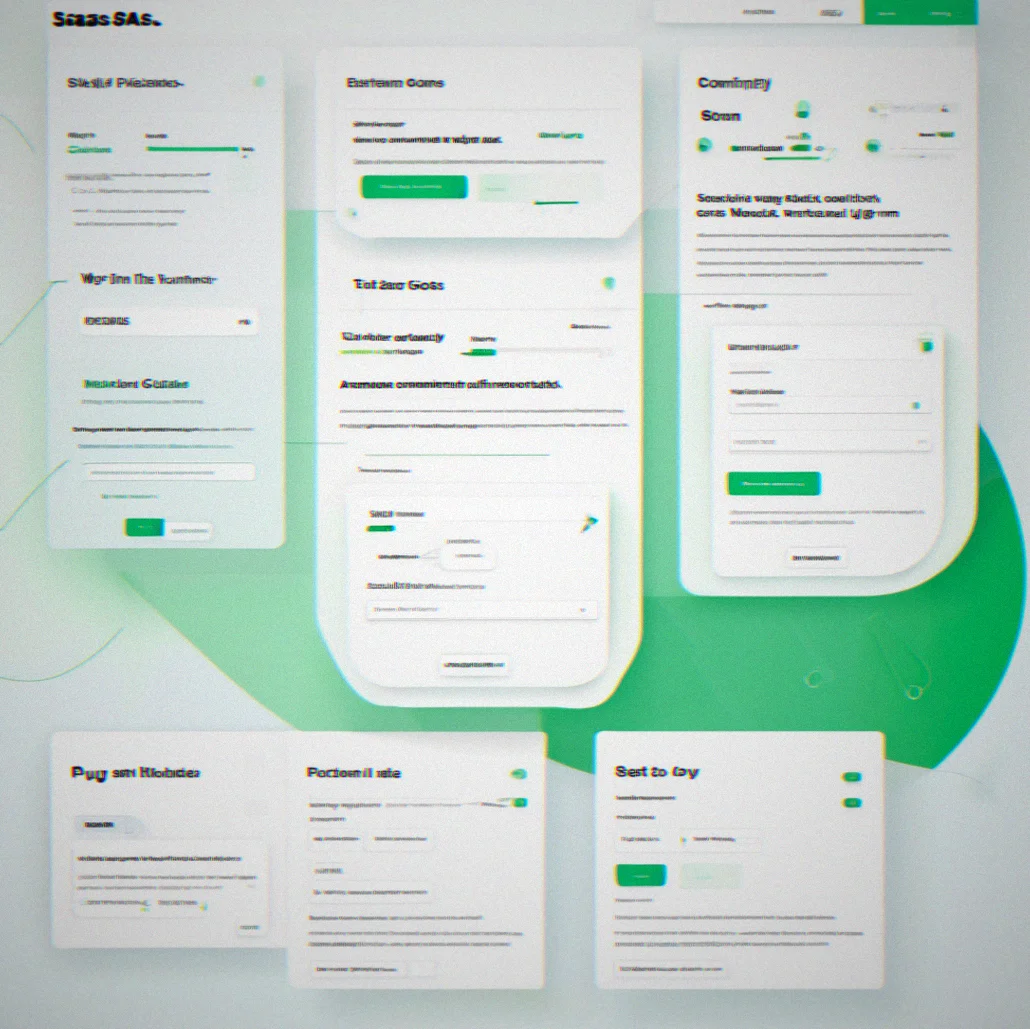
SaaS enterprise platform pricing page that lets you fiddle with a cost calculator—plug in your team size, pick your usage tier, set an annual commitment, and watch the total update in real time
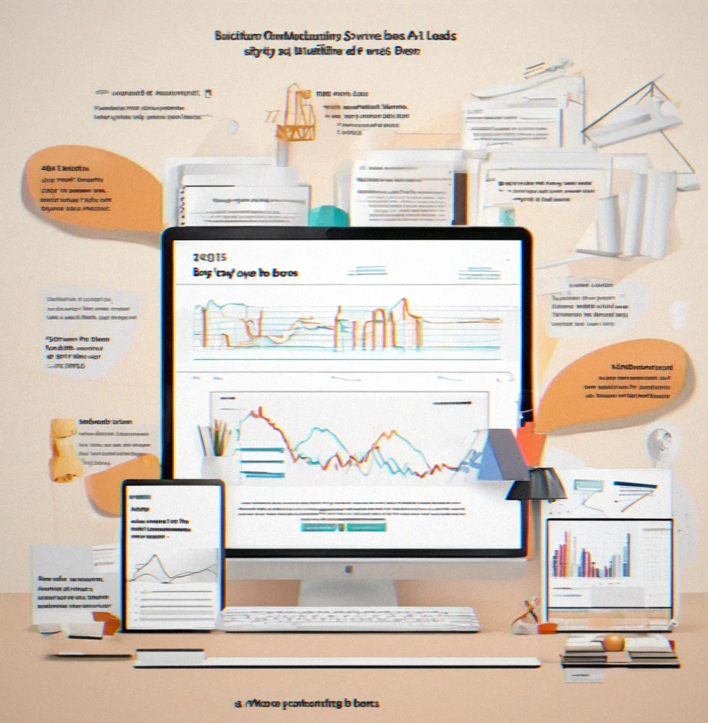
Manufacturing services case study showing before-and-after numbers, where form abandonment dropped by roughly 40% and qualified leads jumped by around 30% once the site got redesigned

Content management dashboard where a non-technical marketing person can edit a blog post using a visual editor, pick publish options from a dropdown, and see the live preview right next to it
We talk to your sales team, customer success, and leadership. Audit the content you have. Check accessibility on your existing site if there is one. We're looking for what's actually broken, not just what you think is broken. First couple weeks.
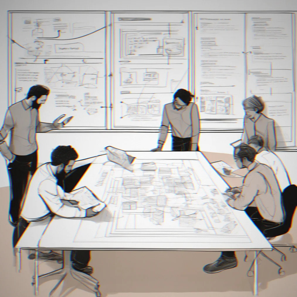
We build the information architecture and wireframes. Figure out the messaging hierarchy. Write one spec document that explains every call we made and why. You sign off on all of this before we open Figma. That step actually matters.
High-fidelity mockups get built. We code the frontend to WCAG 2.1 AA from day one, not as an afterthought. Content goes into your CMS. Your team gets trained on how to use it. This takes a few weeks.
We check Core Web Vitals and Lighthouse scores. Test keyboard navigation. Run screen reader tests with actual assistive tech on real devices, in real conditions. Not just automated checks.

The site goes live. We watch what happens and track the metrics for the next month. One round of fixes is included. After that it's yours. Documentation explains the reasoning behind every decision so your people understand what they're looking at.

Headless CMS setup using Contentful, Sanity, or Webflow. Whatever you pick. Non-technical staff can handle pages, case studies, pricing. You don't need a developer to change content. That's the whole point.

A compliance firm cut sales calls by over a quarter. One SaaS company dropped bounce rate on pricing by about a third. A manufacturing network slashed form abandonment in half. Those numbers are real. Yours will be too.
Common questions
We work with founders and marketing directors who've sat through enough vendor pitches. Here's what we actually tell people when they ask.
Depends on where you're starting and what platform makes sense for you. Discovery runs about two to three weeks, then another month or so for strategy and design, then the build and launch phase takes anywhere from three to six weeks based on how complex things get. You're looking at ten to sixteen weeks soup to nuts. We quote after discovery, not before. For a mid-market B2B site, somewhere in the forty to eighty thousand range is normal. Smaller projects cost less. More complicated offerings push it higher.
We don't. WordPress forces accessibility compromises we won't make. We build with Next.js, Astro, or Webflow depending on how much your team needs to handle ongoing. Already on WordPress? Migration becomes part of the project scope. We move your content over and you end up with a faster site that's actually accessible, and your team can maintain it without pulling their hair out.
The site goes live somewhere between ten and sixteen weeks. Revenue conversations don't flip a switch the moment it launches. But your analytics will show faster load times right away. Your support inbox gets quieter because the messaging is clearer. Fewer confused questions, shorter sales calls. Most people tell us they notice the difference in prospect conversations within a month or two after launch.
Not if we do it right the first time. The strategy we document stays solid for three to five years. Your content evolves, your CMS stays the same. When your offering changes or you rebrand, you update. You don't redesign. Maintenance is normal. Redesigns just because design trends shifted? That shouldn't happen.
We'll push back. We explain it—why information hierarchy actually matters, why accessibility is faster, why that feature you want will muddy your message. If you still disagree, it's your site. We've learned the hard way that a site your team believes in and understands beats a perfect site you resent.
No. We hand it off to you. You own the site, the CMS, the hosting. Everything gets documented. Your team handles content updates. If something breaks technically or you need strategic input down the road, we can jump in as a consultant. But we're not your permanent agency.